I Rebranded - Should You Too? 5 Ways to Know!
Most companies rebrand every 7 to 10 years. But that doesn’t mean you have to just because you’ve reached that age in your brand. However, it is still a good idea to take a look at your brand at this point and make sure it is still effective. Maybe your branding is just 3 years old, but your concerned your brand isn’t what it needs to be and it’s affecting your revenue and customer interest.
Rebranding doesn’t always mean starting from scratch. A brand could just need some simple updates. You are probably wondering…how do I know? It’s easy to be unsure of the timing and the thought of rebranding can be a huge hassle, a potential risk, and even costly.
Let’s take a look at my recent rebrand to help you think about your current brand. My logo was designed over 16 years ago, this was one of my first signs that I most likely needed to revisit my branding, and I only needed a few tweaks and a bit more thought to my brand strategy to update it. Below are some of the elements I focused on to help me make the decision to tweak my brand.

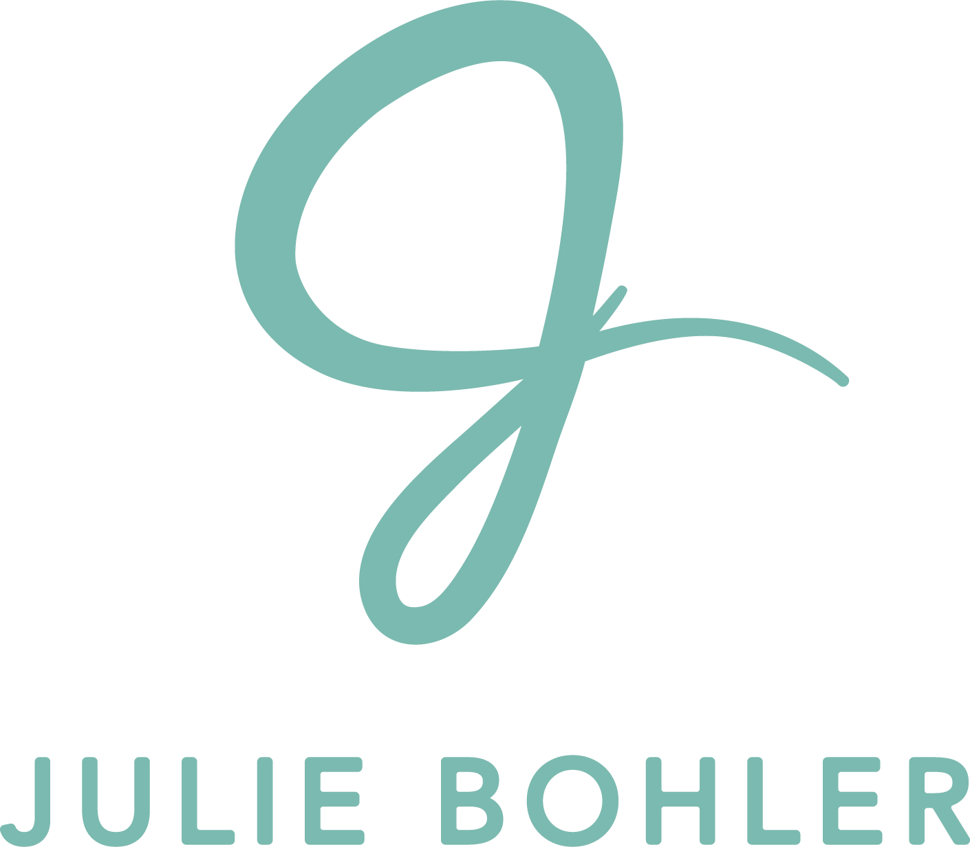
A snapshot of my new branding.

This is my previous brand that I had for 16+ years.
1.
Colors – I felt I had a dated color scheme and my color palette didn’t reflect the business personality I wanted now. Since I created this color palette, I had created my printables collection, Heart Art, and it didn’t blend together like I wanted. The final realization is that I only chose a two color palette, it wasn’t expansive enough, I needed to expand the palette for more creative branding options.


2.
Brandmark – I was never concerned about my brand mark alone. I love it because it is exactly me and I knew that it was still simple, unique, recognizable, and very readable when used in a small size or any size across all print and digital media. So this just needed a color change.
3.
Typography – Over time, the “trendy” thin stroked font I chose back then, became challenging to work with. It didn’t stand out as well as I had hoped and wasn’t the best in readability. The gray color I chose was too light, and although I loved the font many years ago, it just wasn’t going to work with the personality I wanted my brand to be now.


4.
Company Name – At the time I developed my company name, I decided to go for a more literal approach using just the J of my brandmark. The reason? I sign everything except legal documents with just my cursive J, so it seemed fitting to call my business by that name. But years after I began using it, I began to not love it, but didn’t have the time to change it. Just the letter J became confusing for my clients and I didn’t love it on any of my forms. And, in my design industry, artists mostly use their whole names, I felt I looked out of place. So I updated my company name to Julie Bohler Designs, but have chosen to just use Julie Bohler in my visual logo without the word “designs”.
5.
Graphic Elements – I never took the time to develop icons, a pattern, or graphics. It just wasn’t imperative as an independent graphic artist many years ago. But now with the rise of social media marketing, it is very important to have those elements to expand your brand marketing, be able to be more creative in creating templates, etc., and have brand consistency across print and digital platforms.
